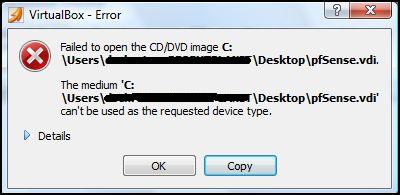
The other day I was playing around with VirtualBox. I had downloaded an image for a router OS called pfSense. This is what we use at work and I wanted to do a little playing and experimenting to see what I could do with it. That’s all great but it really doesn’t matter. What matters is I got this error message while I was trying to load the image file:
Again, the content of the error message isn’t really what I want to emphasis here. I really want to talk about the little button just to the right of the OK button. A copy button.
This button copies the content in the error message allowing you to paste it anywhere you like. This action has been previously unavailable. You can’t normally select the text on one of these boxes. But with this copy button, a person could easily copy and paste the text into a Google search, an email off to a techie friend, a message board for help or into a Word document they are writing. The possibilities are endless!
So my question is, why are all error boxes created like this one? Please developers, add this simple little copy button to your error message boxes!


